🧠 Introduction: Why Font Pairing Matters
Font pairing is one of the most powerful yet overlooked tools in design. The right combination of fonts can elevate a brand, increase readability, and communicate mood—all without saying a word. Whether you’re designing a website, logo, invitation, or 3D-printed object, using multiple fonts that complement each other is essential for visual harmony.
In this guide, you’ll learn the fundamentals of font pairing, discover classic combinations, and find free high-quality fonts from Freefont.pro to bring your design ideas to life.
🎯 What Is Font Pairing?
Font pairing is the art of choosing two (sometimes more) typefaces that work well together. Each font should serve a role—typically one for headings and another for body text.
Successful font combinations create:
-
Contrast without conflict
-
Balance between styles
-
Hierarchy that guides the reader’s eye
🔤 3 Golden Rules for Font Pairing
1. Contrast Is Key
Pair fonts with distinct styles—such as a serif for headlines and a sans-serif for body text. Contrast keeps readers engaged and supports a clear visual flow.
2. Limit the Number of Fonts
Stick to 2 or at most 3 fonts in one design. Too many fonts can make your layout chaotic and unprofessional.
3. Match the Mood
The fonts you choose should align with your content’s tone—elegant, playful, minimal, or bold.
🧩 Classic Font Pairing Examples
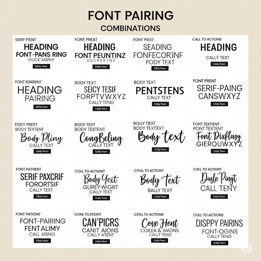
Here are timeless combinations that work well together. All of them can be found or matched with similar fonts from Freefont.pro:
✅ Serif + Sans-Serif
-
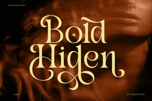
Headings: Playfair Display (Elegant Serif)
-
Body: Montserrat or Open Sans (Clean Sans-Serif)
-
Why it works: Elegant + modern = balanced sophistication
✅ Sans-Serif + Script
-
Headings: Bebas Neue (Bold Sans-Serif)
-
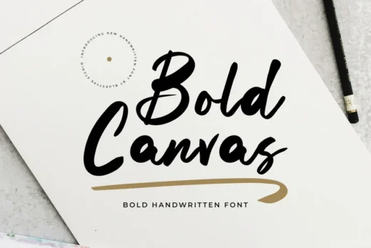
Accent/Tagline: Alex Brush or Great Vibes (Script)
-
Why it works: Structure + personality — ideal for logos and invitations
✅ Bold Display + Minimal Body
-
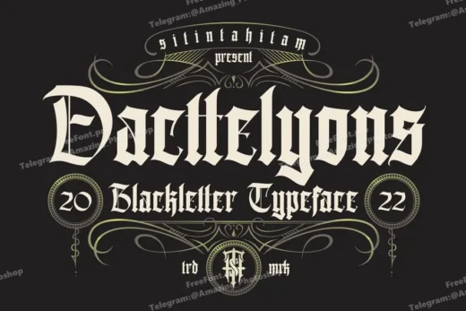
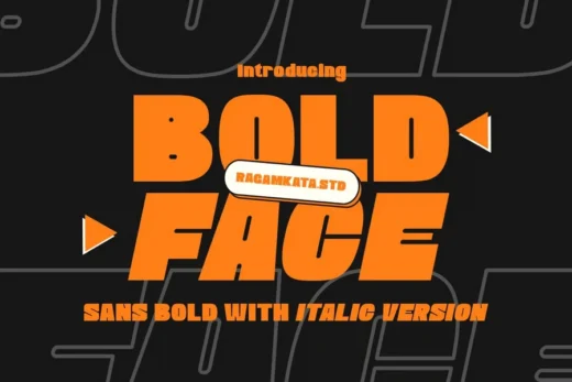
Headings: Oswald or Sagrada (Decorative/Display)
-
Body: Roboto or Lato (Minimal Sans-Serif)
-
Why it works: Eye-catching headlines with highly readable content
🆓 Free Fonts You Can Download Today
You don’t need to pay for Adobe Fonts or premium libraries. At Freefont.pro, you’ll find professional-grade fonts for every pairing strategy:
-
📜 Serif Fonts – Ideal for formal or editorial designs
-
✨ Sans-Serif Fonts – Clean and modern for digital interfaces
-
✍️ Script Fonts – Add personal, handcrafted aesthetics
-
🎨 Decorative Fonts – Make your message pop
You can explore by category, download instantly, and start designing with confidence.
👉 Browse all font categories here: https://freefont.pro
✅ Conclusion: Make Typography Work for You
Choosing the right font pairing is not just about style—it’s about communication. By following basic principles and using high-quality free fonts from Freefont.pro, you can create designs that are both beautiful and effective.
Whether you’re a beginner or a professional, mastering font combinations will elevate your projects and give you an edge in any creative field.
