🧠 Why Font Pairing Is Essential in Modern Design
Choosing the right fonts is more than a stylistic choice — it’s a strategic decision that impacts how your audience reads, feels, and interacts with your content. The practice of font pairing — using two or more complementary typefaces — brings visual contrast, hierarchy, and emotional depth to your design.
Whether you’re building a website, designing a flyer, creating a brand, or printing a 3D model, mastering font combinations gives your work a professional and cohesive feel.
🔍 What Is Font Pairing?
Font pairing is the intentional selection of two or more fonts that complement one another and enhance readability and aesthetics. It typically involves using one font for headings and another for body text, though sometimes a third accent font is added for emphasis.
Great font pairing accomplishes:
-
Visual contrast without conflict
-
A strong sense of hierarchy
-
A mood that fits the content
🔤 Key Principles of Effective Font Pairing
✅ 1. Contrast with Harmony
Choose fonts that are visually different but still harmonious. Pair a bold serif with a clean sans-serif, or a minimal font with a flowing script.
✅ 2. Respect the Role
Headings should stand out and catch the eye. Body fonts should be readable. Accent fonts can add flair but should be used sparingly.
✅ 3. Limit the Fonts
Stick to a maximum of 2–3 fonts in one project. Too many fonts create chaos and reduce clarity.
✅ 4. Match the Mood
Your fonts should align with the emotion or tone of your content — elegant, playful, technical, vintage, etc.
🧩 Classic Font Pairing Examples (With Free Alternatives)
Below are timeless pairing strategies, along with free font recommendations you can download from Freefont.pro:
🅰️ Serif + Sans-Serif
-
Heading: Lora (serif)
-
Body: Roboto (sans-serif)
-
Style: Editorial, modern minimalism
-
✅ Available at: Freefont.pro – Serif & Sans
🅱️ Bold Sans-Serif + Script
-
Heading: Bebas Neue (bold sans)
-
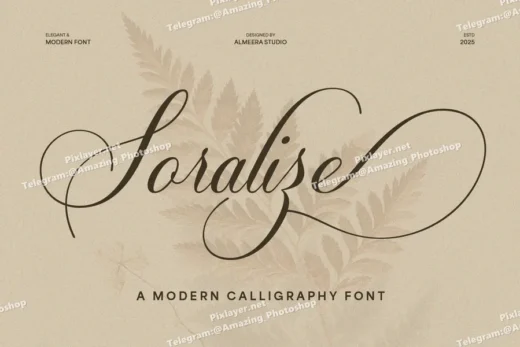
Accent/Tagline: Great Vibes (script)
-
Style: Urban branding, packaging, social media
-
✅ Find both on: Freefont.pro – Script
🅾️ Decorative Display + Neutral Body Font
-
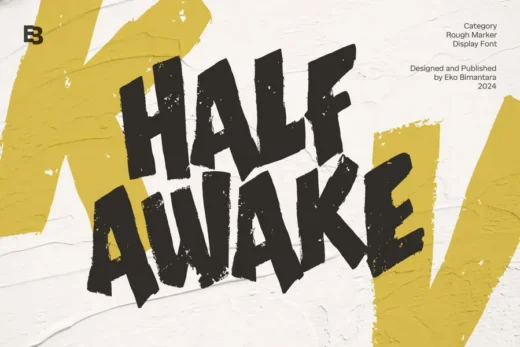
Heading: Sagrada or FoglihtenNo07 (decorative)
-
Body: Open Sans
-
Style: Posters, product labels, event flyers
-
✅ All available at: Freefont.pro – Decorative
🧠 Pro Tips for Designers
-
Pair from different categories (serif + sans, script + sans, etc.)
-
Avoid pairing fonts that are too similar — it can look like a mistake
-
Use font weights to create hierarchy even within the same typeface
-
Test combinations in real content (titles, paragraphs, UI mockups)
🆓 Where to Get Free Font Pairing Sets
🎉 Freefont.pro is one of the best resources to find high-quality free fonts for commercial and personal use. It offers:
-
📜 Serif Fonts
-
✨ Sans-Serif Fonts
-
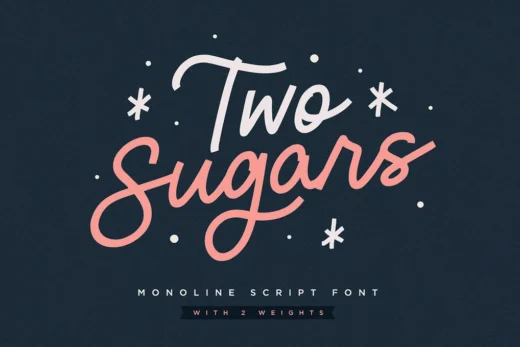
✍️ Script and Handwritten Fonts
-
🎨 Decorative and Display Fonts
Each font on Freefont.pro includes preview images, character sets, and download links. You can sort by style and instantly try combinations in your design software.
👉 Browse all font categories: https://freefont.pro
🔧 Tools to Test Font Pairing
Try out combinations before you commit with these free tools:
-
Fontjoy — AI-based font matcher
Use these to create mockups, experiment with styles, and build your font strategy.
✅ Conclusion: Let Typography Work for You
Font pairing is a foundational skill every designer needs. With the right combinations, your design becomes more engaging, more readable, and more memorable. You don’t need to spend money on premium font bundles—just head to Freefont.pro and explore free font options that look and feel premium.
